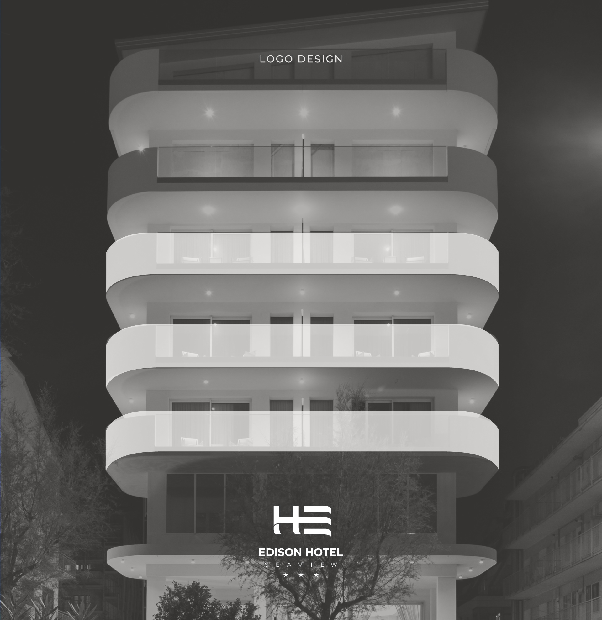
Restyling of the new Edison Hotel Seaview in Sottomarina (Venice - Italy).
The logo was born from the architectural study of the Hotel: taking inspiration from the wraparound lines of the Edison Hotel terraces,
the logo becomes an integral part of the new hotel restyling and helps identify it.
the logo becomes an integral part of the new hotel restyling and helps identify it.
A unique and distinctive logo with a strong and professional character
as well as the font that accompanies it, but at the same time welcoming, thanks also to the central line that wraps and gives life to the letters HE.
as well as the font that accompanies it, but at the same time welcoming, thanks also to the central line that wraps and gives life to the letters HE.
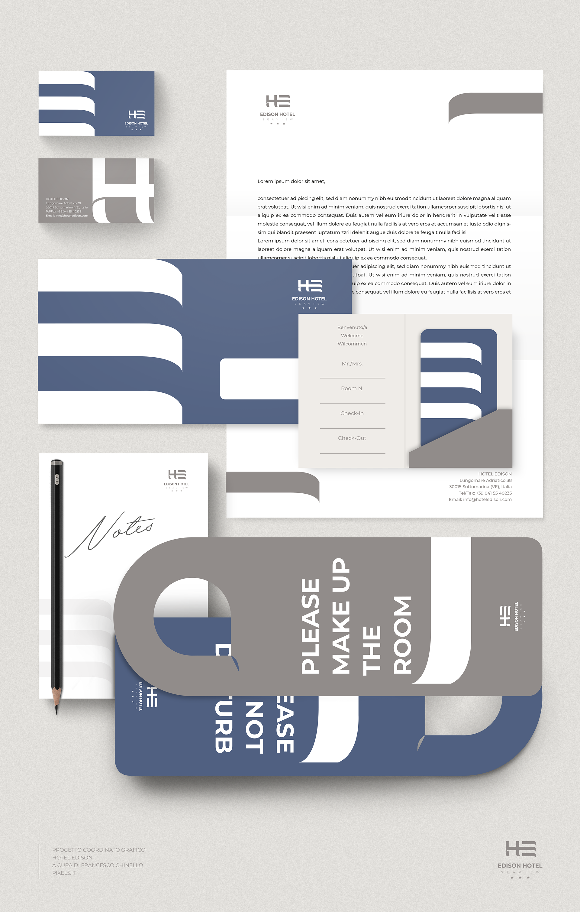
The stationery resumes the lines of the logo and is characterized by colors that reflect the hotel interiors and the beach.
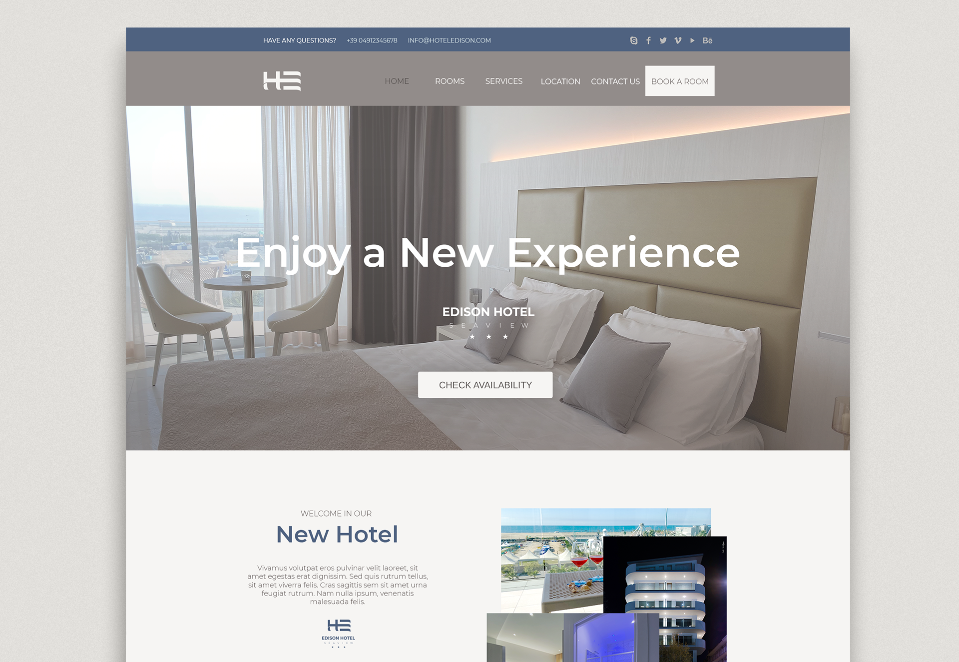
The website is coordinated with the graphic design studio.